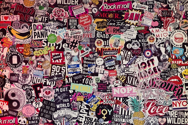
Eight Hacks To Make Your Custom Stickers Stand Out

So, you read incredible tales about the booming business of people who have utilized customized stickers to sell their products. However, you still need to be convinced about introducing custom stickers in your marketing campaigns. What if it doesn’t work out? What if I can’t recover my investment in customized stickers, let alone profit from them? Well, I’m here to help you out. This article will teach you all the hacks you need to make your custom stickers stand out and be profitable in the long run.
Custom Stickers are one of the most straightforward and fun ways for people to express themselves. A sticker could seem like a text- and image-covered piece of adhesive that will ultimately peel off. Many people see it as an extension of their personalities; others see it as a window into enthralling life tales that are interesting enough to discuss.
Therefore, we offer some tips if you need help with your sticker (or a custom label design, for that matter).
Hacks to Make Your Custom Stickers Stand out:
Keep it Plain and Fun:
You should reconsider your assumptions if you think a sticker can tell the world all there is to know about you or your business. You may create a brochure for that. No sticker, no matter how big, can feature a sophisticated graphic. You peek at the bumper sticker but don’t have time to read it.
Whether designing the stickers yourself or employing an expert graphic designer, try to keep the idea you want to convey as simple as possible. You may pick two of the most fundamental concepts from social networking websites. You can either build a mascot in the WhatsApp sticker style or create humorous flashing art in the Snapchat manner.
Work with Different shapes:
The most popular shapes for design stickers are a square or a circle. It frequently works just well. For instance, these stickers seem both hip and professional. Do you want to boost the number of individuals who see your brand? Consider an unconventional form! You won’t pay anything for it, which might improve the design. It is beneficial, especially if your brand’s colors could be more vibrant.
Standard sizes and shapes like round, oval, square, or rectangular are available. Alternatively, you can select any custom size and shape you want. With kiss-cut and die-cut stickers, you can personalize the shape of your sticker design. You could cut your design into the form of your company’s logo.
Find the Humorous Side:
Custom sticker plans that are striking and cut into an extraordinary shape pave the way to a particular something — they’re enjoyable! Stickers are a childhood favorite because they are fun to peel and stick, and that childlike joy lasts well into adulthood. Indeed, even the most seriously disapproved of organizations need to show their silliness, kind and fiery side. Assist them with arriving by being transparent with the message they need to convey.
Brands must capitalize on the fun aspect of stickers to maximize their marketing potential. It is permissible for casual brands to employ cartoons, visual puns, or highly artistic styles for fun imagery. However, what about more reputable brands? You can still experiment with layout and colour contrast in graphic design to create a fun image that doesn’t distract from a more serious message.
More Attention! Fewer Details!
You want your sticker to be noticeable, but if you include too many details, it can stop being useful. The sticker may have a more challenging time standing out, and your main point may be buried in the minutiae. It grew worse even if individuals only caught a brief glimpse of it.
This sticker might be handy for a tattoo artist or band but not for your business. This sticker contains limited information, but the message must be understood and effective.
Match Colors with Your Custom Sticker Designs:
For creative sticker designs, any hue in the color scheme is acceptable. However, those created especially for business must be consistent with your brand. Not all stickers will have your image name on them, so they should at least make their most vital points.
Despite their amusing appearance, these stickers connect three essential components necessary for your success. They use the brand’s colors, showcase a piece of its identity, and appeal to the target market.
Make your Custom Stickers Readable:
The best strategy is to eliminate all text. Your sticker should ideally convey something without words. Make your text extremely large if you have already decided to include it in your stickers. A good idea might be to capitalize all the text on the sticker, like in this Snapchat sticker pack. Give Your Brand Some Room If you were a marketer, you would want all your stickers to say something about your brand. It defeats the purpose of stickers from your audience’s perspective. Putting a company logo on an iPhone case could be more fun.
Because of this, compromising is the only option available to you. Some stickers should mention your brand, and most should be high-quality stickers that anyone would want. Want to avoid signing that deal? Please create a logo that looks so good it would be a great addition to someone’s laptop.
A Method of Reaching Out to You:
We’ve been chattering about how your sticker configuration must be fun and exciting to the crowd. It is time to think about the marketing aspect of your investment. There needs to be a way for some of your stickers to contact you. This format will work best with a QR code, a social media handle, or a website address.
You can choose whether to include this data on the stickers that advertise your brand or product. Place your contacts outdoors with the stickers that come with them. Most brand logos will often be flat to fit the site. If you change your logo to horizontal, you already have a sticker with your brand on it.